Note · 7 May 2026
[de] 01/26 Design
Few things, but precise. Design as a system.
From the studio · Roman Thomas
A visual identity is not a logo alone. It is a system of a few precise decisions that stays recognizable everywhere. From the sign on the door to the website.
There Is Only One Chance for a First Impression
Before anyone talks to a company, they have usually already seen it. A sign, a business card, a website. In that moment it is decided whether what they see inspires trust or not. A memorable logo, the right colors and information in a clear structure pave the way.
That is why I don’t start with decoration, but with a profile. What does this company, this place, this person stand for. Only once that is clear can an unmistakable identity grow from it.
Few things. But precise.
A Logo Is the Beginning
A brand mark gets it down to the essence. The central themes of a brand come together in one concise sign. Its form and its color are the foundation of the entire public presence. That is as true for a workshop as it is for a law firm, a trade business or a store.
What matters is not the logo by itself, but what comes after it. A good mark works small and large, in color and in black, on paper and on screen. It is made to last.
One Identity, Carried Through
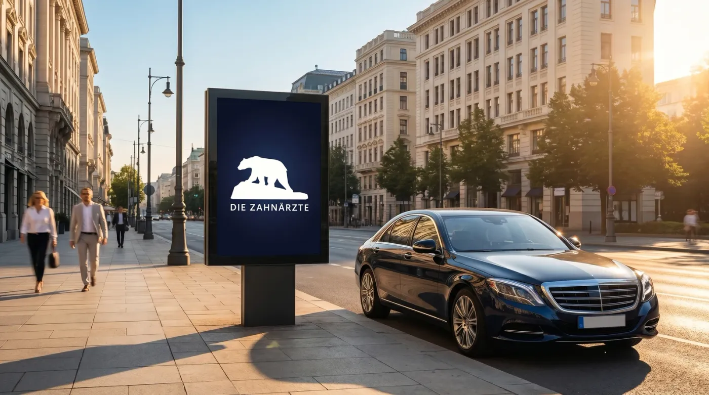
An identity only shows itself when it speaks the same language everywhere. Logo and colors appear consistently throughout, from the sign on the door to the invoice, from the letterhead to the advertisement. Recognizability across the board.
That takes more than a mark. Business stationery, business cards and letterhead, brochures and flyers. Wayfinding and signage, from the sign to the stele to the film on the window. And the website, today often the first point of contact, built lean instead of on a cumbersome system: fast, secure and easy to maintain.

Why This Belongs Here
Corporate design creates a high degree of recognition. It doesn’t decorate, it brings order. It makes visible what a brand, a place or a person is at its core, and leaves out the rest. This is exactly where design meets the guiding idea I work on across all three fields. Bild, Raum, Identität.